Things CSS Could Still Use Heading Into 2023 Chris Coyier
Just a couple of ideas! They came to me while I was poking around thinking of something to say for Alex Trost’s Holiday Mega-Stream (my segment starts here).
Styleable Resizers
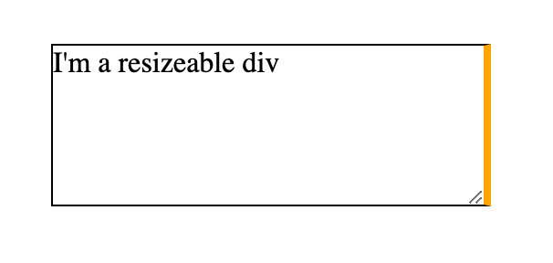
Ya know how a <textarea> is resizeable by default?
That’s a nice default. If users are typing, they should have some control over how much space they have to do it. This type of resizing isn’t limited to <textarea>. You can make anything resizeable so long as it’s not an inline element and it has overflow: hidden;.
div.resizeable { overflow: hidden; resize: both; }Code language: CSS (css)There is also some degree of control. If the direction changes to rtl, the resizing happens from the bottom left (inline-start block-end) direction instead. You can scope the resizing to one direction with resize: vertical || horizontal — or turn it off with none.
What you can’t do is style it in any way. Well, you could position some element on top of it with pointer-events: none, but that’s a weak workaround that doesn’t, for example, affect the interactive area.
That’s too bad, as styling form controls has come a long way, and that’s essentially what this is. Lemme make that resizer match the other styling decisions on my site!
Most importantly, though, I want to be able to move and resize it. I’d like it if, say, I’m making a resize: horizontal element, that the entire inline direction edge is a drag handle. If this was possible it would reduce as much need for heavy JavaScript libraries that help with this.
And speaking of resize: horizontal, shouldn’t resize: inline (and resize: block respectively) work?
That resize handle is a thing that appears in Shadow DOM, as best as I know. Just like number incrementers of a type="number" input, or the track and handle of a type="range" input. We have been able to reach in there to style things, but it’s always been fraught. See A Sliding Nightmare: Understanding the Range Input by Ana Tudor.
It may be that the standards organizations don’t want to specify Shadow DOM implementations, so the implementing browser has some freedom. But that’s putting browsers ahead of authors ahead of users. This is something that would make things better for users, and authors want to do it, so let’s put them over browsers.
Flowable Regions
With columns in CSS, you can make text that flows into multiple columns. But this comes with some pretty extreme limitations.
All the columns have to be of equal width, for one, and you can’t force an element across multiple columns naturally, which is awfully restrictive. Worse, you can’t tell the content where to flow after it “fills” the columns — the area either grows in height or overflows. A situation where a user needs to scroll down to read, then scroll back up to read the next column is unacceptable UX.
Now that we have strong grid layout, allowing content to flow naturally to a defined arrangement of elements placed on the grid would be very nice. I should be able to do this:
Circa 2014, Adobe took this up as a pet project. This was an absolutely perfect project for them, as doing this kind of thing in an app like InDesign is, well, the point of using an app like InDesign, which is used for just a massive swath of all design headed for printing.
Then the “father of CSS” swooped and pooped all over it with a bunch of arguments that I thought were dumb and bad then and I think are dumb and bad now.
It looks like the spec has been picked up as of 2021 again, and I love to see it.
#this { flow-into: my-flow; } #there { flow-from: my-flow; }Code language: CSS (css)Standardized Multi-Line Truncation
Did you know all browsers now support truncating text to a certain number of lines? I wouldn’t blame you if you didn’t because it needs all this code to work:
.line-truncate { display: -webkit-box; -webkit-box-orient: vertical; -webkit-line-clamp: 3; overflow: hidden; }Code language: CSS (css)That’s wild. That’s a very ancient flexbox syntax and an invented line clamping syntax all vendor-prefixed up, plus an awkward required bonus requirement (the hidden overflow) which has sucky side effects (sorry, no box-shadow for you!).
I’d prefer:
line-clamp: 3;Code language: HTTP (http)Browsers can clearly do it! Make it easy!
Mixins & Extends
It would be nice to say hey selector, do all the same styling as this other selector. Sass does that like:
.some-selector { padding: 1rem; border: 1px solid black; border-radius: 5vmin; } .some-other-selector { @extend .some-selector; } Code language: JavaScript (javascript)The trouble with that is those selectors might be in very different places in the Sass, and what you are extending doesn’t necessarily have to match the same specificity, so there are some real source order and specificity challenges with it. The browser could do extends much more naturally, essentially embracing the hey selector, do all the same styling as this other selector spirit without all the awkward compromises.
Alternatively, mixins could be like this:
@mixin stuff-to-reuse { padding: 1rem; border: 1px solid black; border-radius: 5vmin; } .whatever { @include stuff-to-resuse; }Code language: PHP (php)With Custom Properties, we wouldn’t even really need to ability to pass in parameters to a mixin because you could use the selector scope for --whatever-you-want.
Weird twist… Style Queries will kinda be able to do this. Take that multi-line clamping idea… it could be done like this:
@container style(--clamp: 3) { .card { display: -webkit-box; -webkit-box-orient: vertical; -webkit-line-clamp: 3; overflow: hidden; } } .random-element-with-a-card { --clamp: 3; }Code language: CSS (css)That feels a lot like a mixin to me. But I’d prefer a more direct syntax. I also think we essentially need either mixins or extends, probably not both.
Single-Line Truncation from Either Side
Apparently, truncation is on my mind. You can also truncate a single line. Also requires multiple properties:
.single-line-trucation { overflow: hidden; white-space: nowrap; text-overflow: ellipsis; }Code language: CSS (css)This time it doesn’t really bother me. Maybe dropping the overflow: hidden requirement would be nice, but having to stop the wrapping for single-line overflow is fair.
Here’s the problem, though: this will only trigger the ellipsis on the inline-end side of the element. You can’t tell it to truncate from the other side.
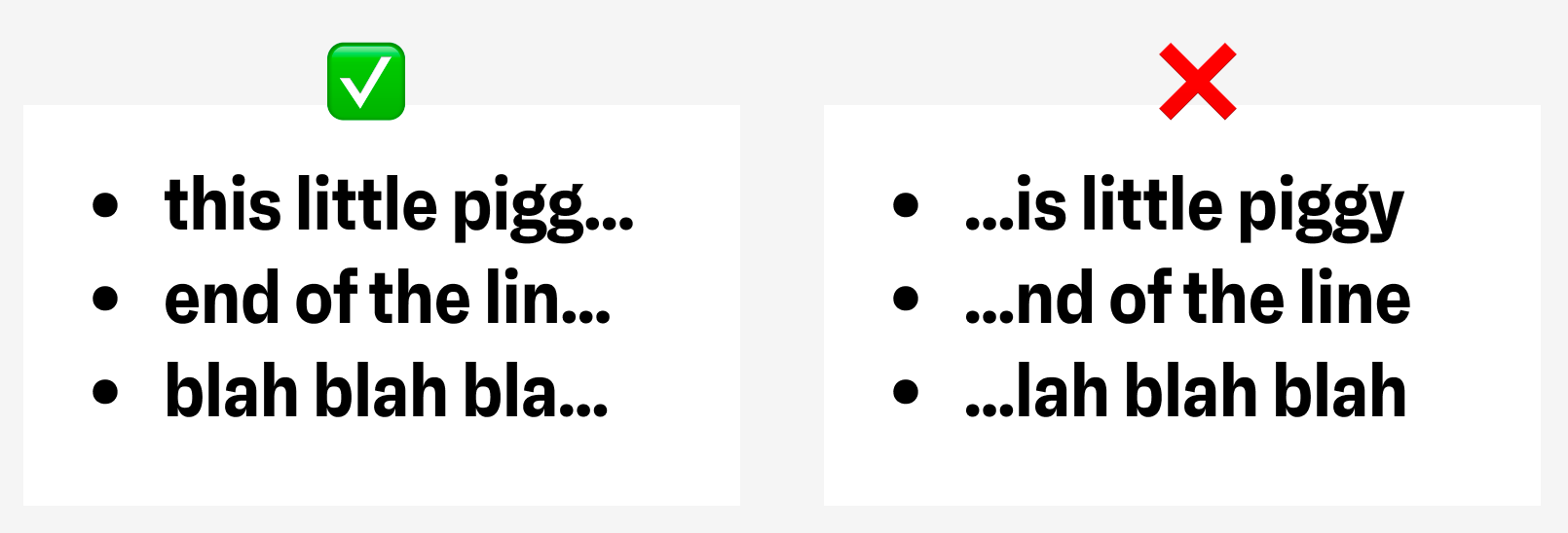
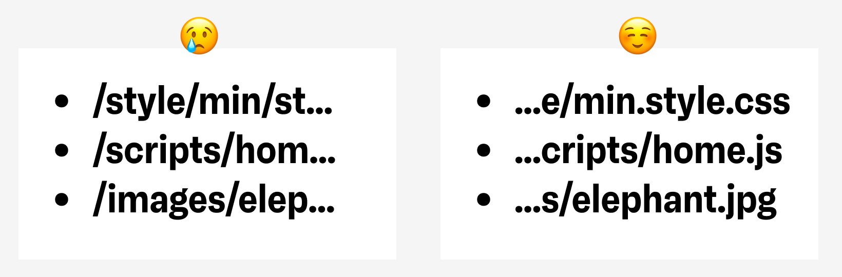
This matters, as what if the “important part” of the text is actually at the end? Like, say, a file path.
You can “trick” an individual element to truncate on the other side by reversing the direction, but, ehhh, that doesn’t seem like a good plan for text that isn’t actually in that direction (I gotta imagine there are bad accessibility implications to that).
Animate to Auto
You cannot truly smoothly animate from height: 0 to height: auto. This is a huge bummer as something like an accordion design pattern has arbitrary height content in the panels and should be able to contract to zero then expand out to “whatever the natural height is” in a consistently-timed and smooth way.
.this-should-just-work { height: 0; transition: height 1s; } .this-should-just-work[data-open] { height: auto; }Code language: CSS (css)There are poor ways around this, like animating max-height instead (no smooth ending, have to guess at sizing) or using JavaScript to animate instead. CSS should be able to do it. It can’t be that hard, right?!
Weirdly enough, there is a pure CSS trick today involving animating grid-template-rows. Here it is. Start with a wrapper to set the grid on:
<div class="content"> <div class="inside"> Totally arbitrary content! </div> </div>Code language: HTML, XML (xml)Then set it up like this:
.content { display: grid; grid-template-rows: 0fr; transition: 1s; overflow: hidden; } .content .inside { min-height: 0; } .content.expanded { grid-template-rows: 1fr; }Code language: CSS (css)So all you gotta do is toggle the class expanded on the parent wrapper there and it’ll work.
I was just messing around with this the other day when I noticed the “dynamic island” on iOS can morph to whatever needed size too, so I made a demo of that:
Nesting
Clearly.
Related
ncG1vNJzZmibmKe2tK%2FOsqCeql6jsrV7kWlpa2dhZ3xzfY6tn6Kml6h6pL%2FSZpqorZyZerTAyKWjZq2jmnqpscCdoKefXZ67tbuMa2dra18%3D